You need to put lots of thought and effort into every page of your website. But your About Us page is arguably the most important.
Why?
Anyone who is reading your About Us page is interested in learning more about your company. If you write this page properly, it can be used as an effective lead generation tool.
Put yourself in the mindset of a website visitor who is reading this page.
They've already stumbled upon your website, so they have a general idea of who you are and what you do. However, they may not be ready to become a customer yet.
This is the perfect opportunity for you to convince them. I see many About Us pages on a daily basis that are boring and don't provide any value to a website.
It's as though some companies write their About Us pages as fast as possible because they think it's just a requirement to be fulfilled.
You put much effort into scaling lead generation through blogging, which you have to update on a regular basis. But your About Us page will be much easier since you don't have to update it as frequently.
If you do it right the first time, your About Us page will help you get more conversions.
I'll explain everything you need to know to create an About Us page that generates leads and drives more sales. Here's what you need to do.
Don't waste space and be repetitive. The website visitor has already clicked on the About Us section of your homepage, so you don't need to use that as a headline as well.
Instead, use a headline that enhances your perceived value.
Check out this About Us page from SAXX:
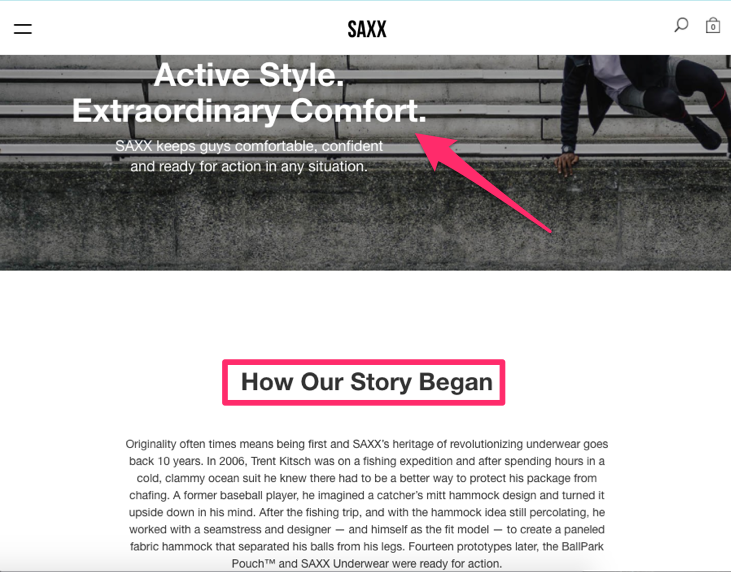
I love this headline because it speaks to the potential customer. SAXX is a men's underwear brand. So the headline of their About Us page reflects consumers' wishes.
Active style. Extraordinary comfort.
This headline is intriguing to say the least. It's also enticing enough to make the reader continue on the page. If you have a boring headline, people may not even read your content.
The same idea is behind writing a blog introduction that makes the rest of your post irresistible.
I also shares this example because SAXX uses multiple headlines on the page. As you read on, you see the second title, "How our story began."
This makes it clear to the reader what this section is going to discuss: the founding of the company.
You will learn about it through a story rather than cold facts, which brings us to our next point.
As I was saying, you should try to incorporate storytelling into your About Us page.
Stories keep people interested, ensuring they will read through the page.
If your content is stale, nobody will want to read it. You'll miss out on tons of potential leads.
Not sure how to tell a story? Just be honest, and talk about how your company got started. You don't need to go over financial details or anything like that unless it's very entertaining.
For example, if you found a way to turn a $20 bill into a business, that could be an interesting read. But nobody wants to hear about your startup loan negotiations at the local bank.
Tell a story that focuses on your company's mission. What was the inspiration for starting your business? Here's an awesome example from the TOMS About Us page:

People may or may not be familiar with this organization. Their concept is pretty simple: for every pair of shoes bought on their website, they donate a pair to a child in need.
The inspiration behind TOMS came from the experience their founder, Blake Mycoskie, had when he saw poor children with no shoes. Witnessing that inspired Blake to form this company.
It's easy to learn how the company became what it is today since it's told as a story.
It's heartwarming and touching and stirs a variety of other emotions in a reader.
Potential customers may be moved by this story and inspired to help these children as well by purchasing shoes from the website.
Being this transparent and open about their story on the About Us page helps TOMS generate new leads.
Your About Us page should definitely be professional.
Make sure it's checked for grammatical and spelling errors. Don't swear or use slang.
While it's important to make sure your About Us page is clean and proper, you don't want it to sound like a dissertation written by a doctor.
You want to make this page as readable as possible. If people can't understand what you're saying, you won't generate new leads. This isn't a legal document, so it shouldn't sound like a team of lawyers wrote it.
Avoid using industry terminology.
Other business owners in your industry may know what you're talking about, but they aren't your customers. You need to put things in common language the average person can understand.
Read this About Us page from Apptopia:
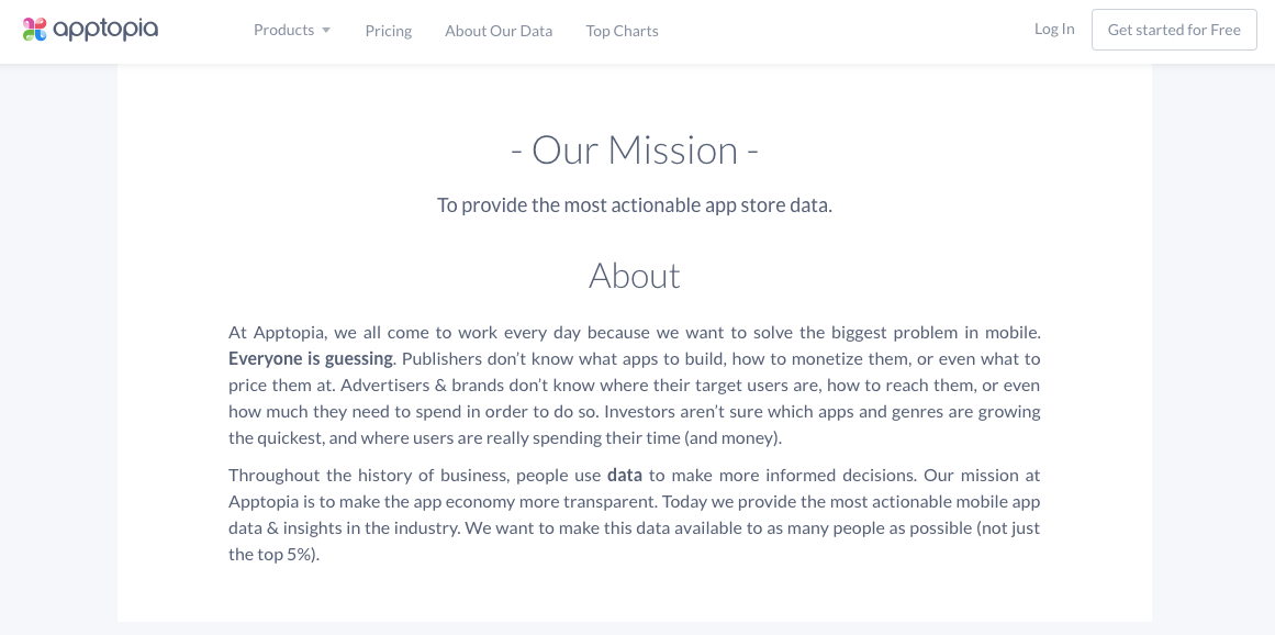
Apptopia is in the mobile application's industry. They help businesses acquire more customers with mobile app analytics tools.
This is something that nearly every business can benefit from, but not everyone will understand.
That's where their About Us page shines. They acknowledge this space is a little bit complicated and people aren't sure what to do with their mobile apps.
They mention all types of potential customers, including:
Their page explains that people use data to help them make decisions, but they aren't sure how to get and analyze certain data.
This transparency can help their leads feel comfortable. It's written in plain language everyone can understand. You don't need an IT degree to decipher this page.
As a result, they'll be able to get more leads. If their page was super technical, it wouldn't have the same impact on potential customers.
It's important to keep this in mind, especially if you're in certain industries.
I'm a big advocate of using pictures and other visuals to break up written content. If you've been reading my blogs for a while, you know I use pictures to aid my writing.
Apply that same concept to your About Us page.
Big blocks of text are intimidating. People aren't on your website to spend all day reading. So write in short sentences with paragraphs that are only a few lines long.
Use pictures as well. Images can make your About Us page more appealing. It helps people scan content since the photos act as natural breaks in the page.
Here's an example of how DeWALT uses images on their About Us page:
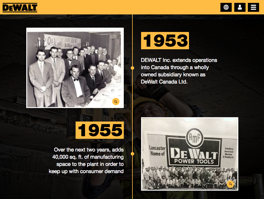
I think this idea is very creative. This page establishes a timeline for their company that dates all the way back to 1922.
For each company milestone, they have a quick description and an image to go along with it. This concept makes it really easy for people to scroll through and learn about the history of this business.
As you can see, the images add value to the written content as well.
Rather than just stating something about a particular milestone, they have photos to illustrate it.
It's also really cool to see how the quality of these images changes over time.
Now, I realize that not every business has nearly 100 years of photos to use for a timeline. However, that doesn't mean you can't use images on your page.
If you're describing an event, product, service, or person, add a picture to enhance the story.
All too often I see About Us pages that focus on the founder of the company. While there's nothing wrong with talking about your personal accomplishments, it doesn't mean you can't showcase your employees.
The average Joe can't always relate to a CEO. But they can connect with other workers. So including information about your employees helps humanize your company.
It shows there are real people representing your brand. Adding the names, positions, and photographs of your staff also helps add credibility to your business.
So if someone wants to reach out to your human resources department, they know exactly whom to ask for when they call.
Here's an example of this strategy used by BuildFire:
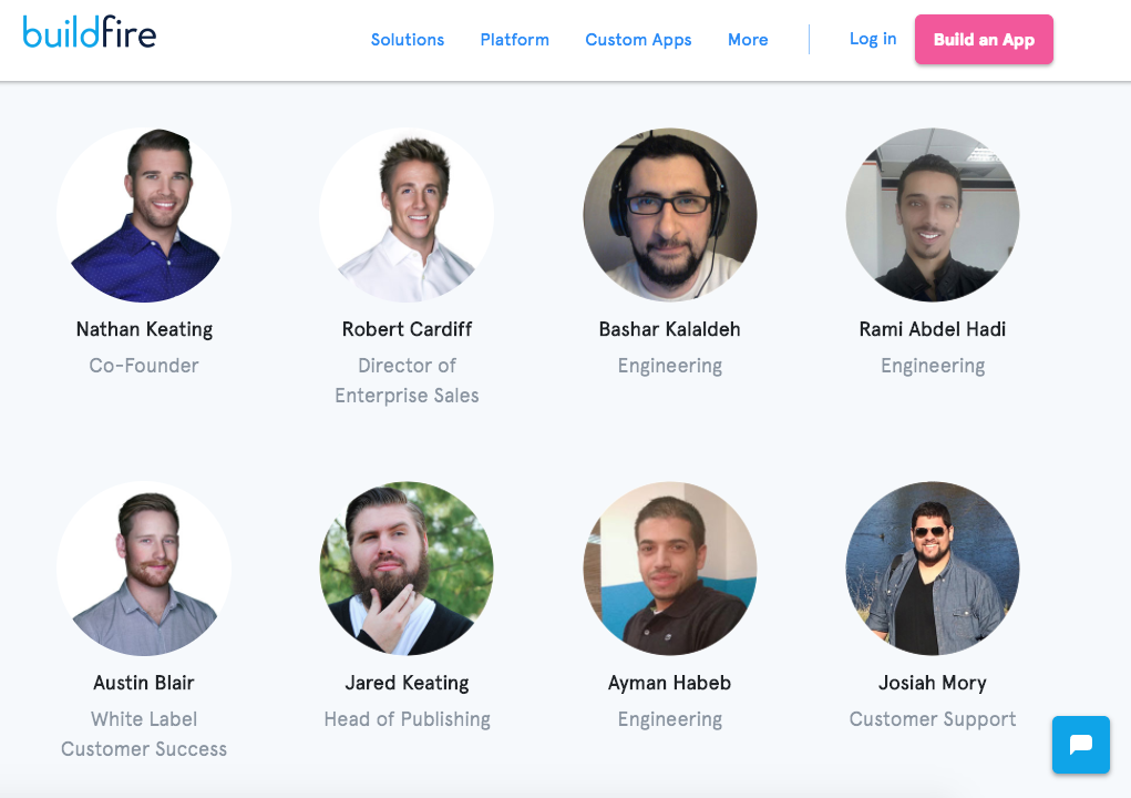
At the bottom of their About Us page, they feature their entire staff. It shows photographs along with the names and positions.
You can even take this approach one step further and add a small biography of each member of your staff.
Don't be boring. If your About Us page doesn't leave a lasting impression in the minds of the website visitors, it won't help you generate leads.
Not everyone who visits this page is ready to be a customer at that moment. They need to let that information soak in before they decide to pull out their credit cards and buy something.
So you've got to come up with a way to leave a lasting impression. But don't go too crazy or do anything that doesn't reflect your company.
Check out this About Us page from Cultivated Wit:
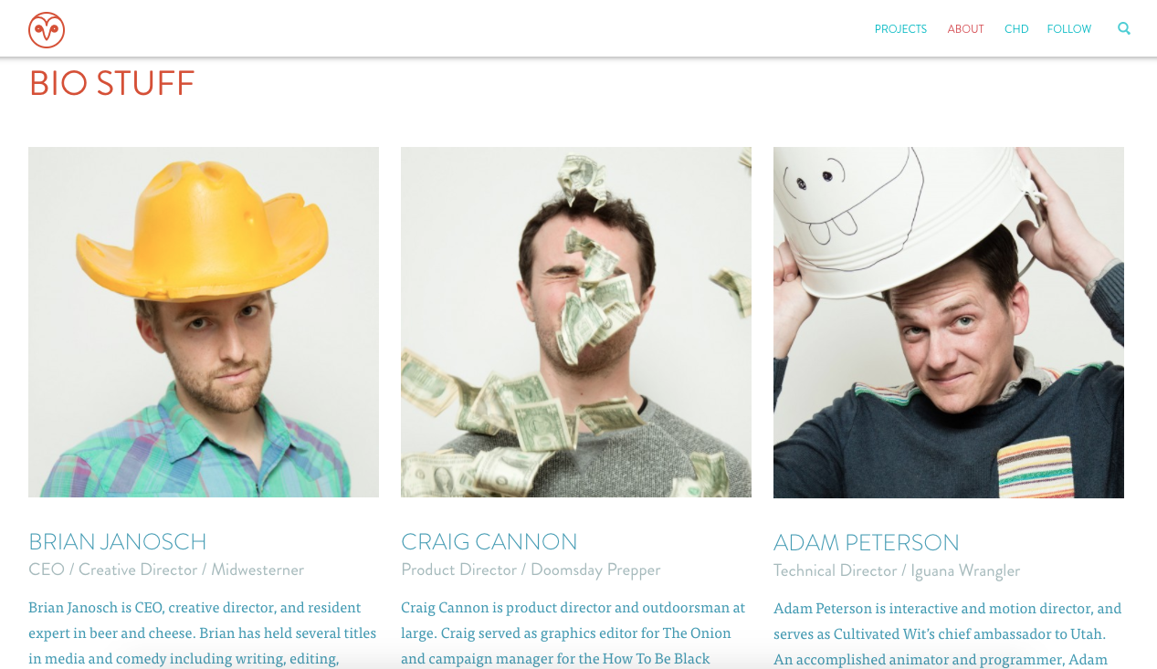
It's another example of showcasing employees and adding a biography, as I previously suggested.
Look back at the photos in our last example of BuildFire and compare them to the photos from Cultivated Wit. As you can see, there's a drastic difference.
These aren't typical or what you'd expect to find on someone's website. While it's a little bit out there, it's done in good fun. Plus, Cultivated Wit is a comedy company, so it fits nicely with their brand.
Photographs like these may not work well for a company that specializes in retirement investments, but it works well in this case.
Depending on your industry and branding strategy, try to have a little bit of fun with your About Us page so it's memorable.
So a website visitor got through your entire About Us page. Now what?
You can't expect them to navigate over to your ecommerce shop and start buying things. While that would be great, you'll need to give them a sense of direction.
Just because it's an About Us page doesn't mean you shouldn't continue to market your products, services, and brand.
Go ahead, pitch whatever you're selling. You've already got the visitor primed to become a customer if they've made it this far. End with a call to action that seals the deal.
After explaining their background and company story, this is how the Cali Life Co. generates leads at the bottom of the About Us page:
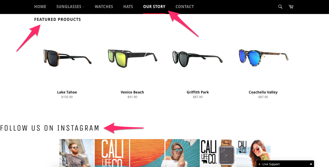
They jump right into showcasing their top products. The Cali Life Co. even has a link to promote their Instagram page.
It's obvious that their general marketing goals are to drive sales and increase their social media presence. So adding these two sections to their About Us page helps them accomplish those goals.
Generating leads can be tough.
But if you've got someone visiting your website, you're already halfway there. Taking the time to write an actionable About Us page can help you scale lead generation.
Use a strong headline to capture their attention. Then tell a story that keeps the reader hooked. Just make sure you're speaking in terms everyone can understand.
Add images.
Instead of just talking about yourself, provide some information and quick bios about your staff.
Ending with a strong CTA will help ensure your new leads get hooked.


