Every business needs to be active on social media to be relevant in today's digital world.
So if your company is on social media, it's a safe bet that you're uploading photos to your profile on a regular basis. Pictures and other visual elements will improve your marketing strategy.
But it can be challenging to find the right pictures to post.
Let's say you want to upload at least one new picture to a social platform each day. That's 365 images per year.
Lots of businesses don't have a library of that many original photos. So they just take a random picture and post it to their profiles last minute without putting too much thought or effort into it.
This is going to be a major problem for your business if you're using a similar strategy.
Everything you share with your followers on social media must have a purpose. In order to get the best results from your campaigns, everything needs to be high quality.
Fortunately for you, technology has advanced to the point where you have a professional quality camera in your hand or pocket in nearly all waking hours.
You don't need fancy equipment to take great marketing photos. All you need are some basic photography skills and inspiration for your subject matters.
Every day, 300 million pictures are uploaded to Facebook. Instagram has an average of 95 million photos uploaded daily.
If the photos you add to social media don't look professional, it's going to hurt your brand image. That's why I identified these 12 tips to improve your social media marketing photos.
The rule of thirds is one of the most basic photography skills that you should get familiar with.
This technique will improve the composition of your photos and create balance, which is more visually appealing to anyone who sees the picture.
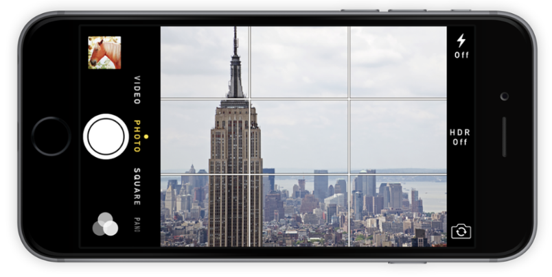
Your smartphone allows you to enable grid lines when you're taking a photo.

This feature makes it easier for you to follow the rule of thirds.
The grid is very simple. It's just two vertical lines and two horizontal lines that are all spaced apart equally.
You should position your subject matter and anything important in your photo where those lines intersect.
An amateur photographer just centers everything on the screen. But that's not as appealing.
By using the rule of thirds, the image has more room to breathe.
Just look at all of the open space in the skyline above. This puts more emphasis on your subject matter.
Plus, people are used to this tactic being applied in professional photography, whether they realize it or not. So when someone sees a photo without the rule of thirds applied, it will automatically not seem as attractive to them.
Symmetry is another visual element that we are just naturally drawn to.
So if you have the opportunity to capture symmetry in an image, you should definitely do so.
Here's a great example of a photograph with symmetry.

It's simple, but it works.
Now, take a moment and imagine what this photo would look like if it weren't taken from this angle.
If the camera was positioned slightly to the left or right, the symmetry would be lost.
Sure, it may still seem like a nice picture of a walkway going out into a clear ocean on a beautiful day. But capturing the symmetry elevates the image and brings it to a more professional level.
Your pictures need to stand out to draw attention from your followers.
If it looks like an amateur is taking all the photos, it will reflect poorly on your brand. We both know you don't want that to happen.
Another rookie mistake that I see people make all of the time is using the zoom feature.
Manually zooming in on a subject is a big no, unless you're using a professional camera to take pictures.
But like I said before, that type of equipment is unnecessary. Your smartphone will capture pictures that are good enough to post.
However, once you start zooming, it damages the quality of the photo.
Instead of zooming, just get closer to your subject. If that's not possible, don't worry about it. Take the picture from where you are and use the rule of thirds to improve the composition.
After the photo is taken, you can just crop the image to your liking.
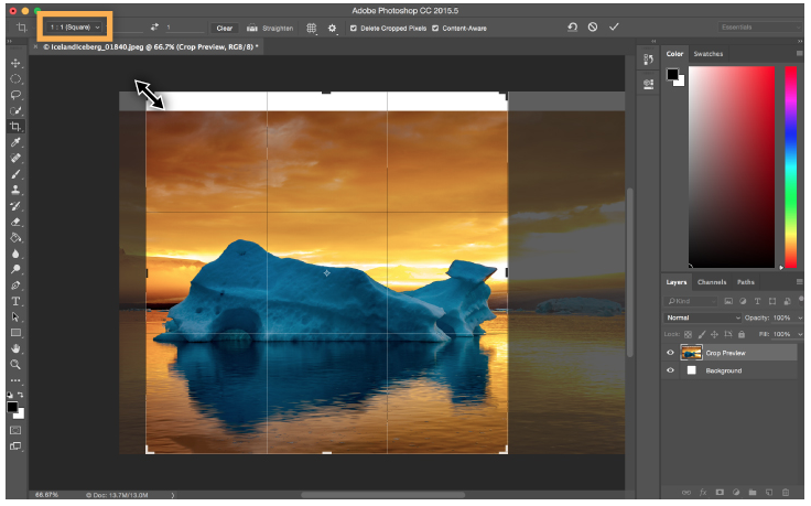
Here's an example of how to do this in Adobe Photoshop.

For the most part, you shouldn't need to do this on your computer. You can crop photos directly from your smartphone.
Notice how even though this picture is being cropped, the rule of thirds is still being applied.
The reflection in the water is also a nice touch, but we'll talk more about that shortly.
Framing your image is another basic photography skill. No, I'm not referring to developing your photo and putting it into a wooden box.
Sometimes subject matters are perfectly positioned to be captured within a natural frame surrounding it.
Any time you have the chance to use a natural frame, you should take advantage of it.
Here's a simple photo of an airplane wing that has a natural frame.

This image is perfect for so many reasons.
First, if you try and get too close to the window to take the picture, you'll end up getting a glare. Second, the wing by itself is just too boring.
By adding the window to the picture, it elevates the quality of the picture to the next level. You get the see the lighting changes and the shadows as the natural light from the sun comes into the plane.
Here's the thing, if you're not happy with the natural frame you can always just edit it out by cropping the image, as we previously discussed.
When you're taking a photo, keep an eye out for natural frames such as trees, fences, bridges, archways, or anything else that creates a similar framing effect.
I briefly mentioned this before when we were talking about cropping. Taking photos of reflections can add a really unique perspective to your photo.
Check out this example from Todo Bien Tours.

Todo Bien gives private coastal bus tours in southern California.
So obviously they want to show their social media followers what their bus looks like. But rather than just showing a boring picture of the bus, they use a reflection to capture the water and coastline during a sunset.
It's a creative way to show off your photography skills.
Taking a picture of just the bus or just the sunset would be average and pretty basic. But by capturing both in the window reflection, it elevates this campaign to new heights.
Just like symmetry, patterns are another great way to capture the attention of your followers.
Sometimes finding the right pattern is all about shooting from the right angle and perspective. Just look at this photo of bike wheels to show you what I'm talking about.

This pattern isn't necessarily present from every angle.
If you step back and photograph these bikes from above, or head on, the pattern wouldn't be the same. It would just look like a row of bikes.
Yes, the subject matter may still be relevant enough and usable for your marketing campaign, but it can be improved by using this strategy.
Earlier I briefly mentioned how you don't need a professional camera or expensive equipment to take high quality photos for your social media campaigns.
But with that said, it can't hurt to invest in something small, like a tripod and mount for your smartphone.
The tripod will allow you to go hands-free when taking a picture. Plus, it helps ensure that the image is level.
You can also use this type of equipment to extend your range and make it a little bit more comfortable to hold your phone securely.
Joby has a bunch of great products for this purpose.

You can check out their website to browse for what you need.
Otherwise, there are thousands of other similar products available online from other retailers as well.
Most of these are pretty inexpensive. You can find a quality stand and mount for under $50. It's worth having, even if you don't use all of the time.
You don't want your social media marketing photos to look like everything else out there.
It's important for your brand to come up with new perspectives to separate yourself from the crowd.
I really like this example from Tropicfeel on their Instagram page.

The picture itself is beautiful. The houses, ocean, and coastline grabs the attention of an audience right away.
But something about this photo is a little bit different than you normally expect.
It's not typical for people to put their legs and feet in this type of shot. Usually, you'd expect this to be a selfie or just a landscape shot.
But Tropicfeel uses this unique perspective to showcase their product, which is the shoes in the photo.
Look at the caption.
They created a new hashtag of #tropicselfeet to encourage other people to take this type of photo as well. This is a great way to write instagram captions that drive engagement.
So find a perspective that's unique to your brand.
For example, let's say your company sells skateboards. Rather than just taking a picture of a guy on a skateboard, you could mount a camera to the nose of the board.
You don't always want to just take pictures of your products.
People are a great subject matter for your social media campaigns. In fact, photos with faces get 38% more likes and 32% more comments than photos without them.
But your subjects don't always need to be posing.
Candid shots add a human element to your brand. They show people in action, as opposed to just putting on a show for the camera.
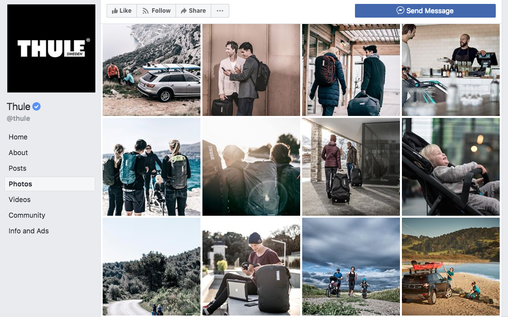
Take a look at these photos that were uploaded to the Thule Facebook page.

None of the people in these pictures are posing.
All of the shots are candid.
The reason why this works is because it shows an audience how people behave naturally when they are doing something.
This is an opportunity for you to showcase how your products and services can be used on social media.
I also like the idea of taking candid photos of your employees. By showing your staff in photos, it creates a more authentic interaction with your audience. Your followers will realize that there are real people behind the scenes of your brand.
Think outside of the box.
You need to realize how many pictures are flooding the timelines of your followers on a daily basis. If your marketing photos don't jump off the page at them, they'll just simply keep on scrolling.
Abstract images are a great way to capture attention, like this one from the Allbirds Instagram page.

Allbirds has a line of shoes called tree runners. So lots of their posts encompass nature and different photos of trees.
This one is definitely one of the most unique photos that you'll see on their profile.
It's art painted onto a fallen tree trunk. The image on this unconventional canvas is a nature scene, which also includes trees.
At first glance, a social media user might not even realize what they're looking at.
But it's definitely enough to stop them in their tracks for further examination.
Stop taking yourself so seriously.
OK, there are certain businesses that need to more serious than others. If your company specializes in things financial investments or funerals, you probably shouldn't be cracking jokes on social media.
But those types of brands are just a small percent of the population.
If your company sells products or services to a target audience that can appreciate some humor, don't be afraid to take a funny photo for your social media campaigns.

36% of consumers are prompted to make a purchase after seeing a funny post from a brand on social media.
So taking a humorous photo can do much more for you than just drive engagement. This strategy can directly lead to sales.
Just make sure you stay away from controversial subjects.
I definitely don't recommend making jokes about subjects like politics or religion. Photos like that can really damage your brand.
So keep it light, but stay professional.
How can you make your marketing photos jump off the page to social media users?
You want your posts to make people say, "Wow!"
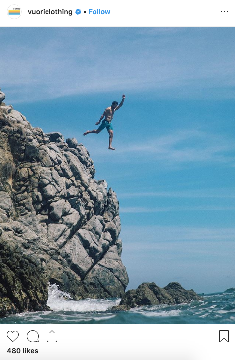
Leave them in awe. Here's an example from the Vuori Instagram page.

This post is advertising their men's swimwear.
A conventional idea would be just to photograph a picture of the swim trunks. That's boring.
Another idea could be showing a model wearing the bathing suit, or even swimming in it. But again, that's boring as well.
It's conventional, and audiences expect those types of posts from brands.
You know what's not conventional? A guy jumping off a cliff into the ocean wearing those shorts.
This photo is awesome. It's definitely the type of post that will grab the attention of users on social media.
If you want to run successful social media campaigns, you need to focus more attention on the quality of your marketing photos.
Don't worry, you don't need to buy expensive equipment or hire someone to do this for you. It's easy to take and edit photos without hiring a professional.
All you need is some basic photography skills to get you started in the right direction.
After that, it's just all about deciding what types of photos will speak to your target audience on these platforms.


