The emphasis here is on first. This guide is meant to help you get your first dirty brand identity out the door.
It's meant to be functional and good enough for now.
Both options will get you to the finish line. The trade off is your time vs. your money. If you are short on money, then do it yourself. If you are short on time, then use 99designs.
If you were to get a high quality, professional brand identity, it'd cost you tens of thousands of dollars (or $211 million).
A more professional approach with an agency would look something like this. If you hire 99designs, you won't get this level of quality, but you'll still have a very functional starting point. 99designs has a brand identity package that starts at $599.
If you aren't familiar with 99designs, it's a platform that runs design contests. I particularly like the contest approach for your first brand identity because chances are you don't know exactly what you want yet. Having a bunch of options to choose from will help.
A brand identity can be extensive, but we'll just focus on a few things that you need to get off the ground. Everything else is a bonus.
A more extensive brand identity might include things like: design systems, custom illustrations, photography guidelines, iconography, interactive elements, video or motion and even a full out web design. We don't need more than the first 3 items: a logo, colors, and font/typography.
If you go with 99designs, when all is said and done you'll automatically end up with everything you need.
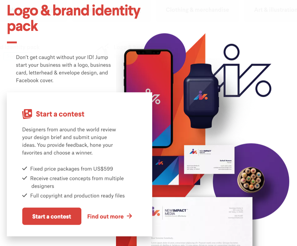
You'll start a contest, which will attract many designers to submit designs. They'll typically start with the logo and go from there. You'll have the opportunity to rate designs, submit feedback and tweak until you find the winner.
There are obviously a number of advantages of going the 99designs route, vs. DIY — however, if you don't have the budget, then you don't have the budget. In that case, here is how I would go about doing it myself, if I were in that same boat.
Start with Brandmark. It's a very cool tool that is essentially a logo generator. Creating your logo will give you the essentials you need for your brand identity. I say start here because while Brandmark can give you what you're looking for, it's also very limited.
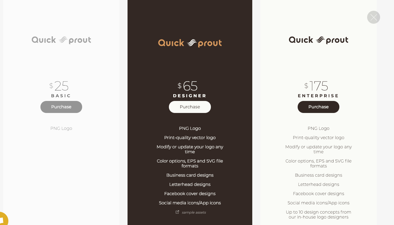
It used to be free, but now it looks like they are charging for the logos. You can still design as many logos as you'd like; but now you'll pay to download the files ($25–175 depending on the package you pick). Still, that's a very cheap option.
I went through the process for an example, and outlined it with images below:
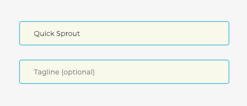
Step 1: Enter your name and tagline if you want one.
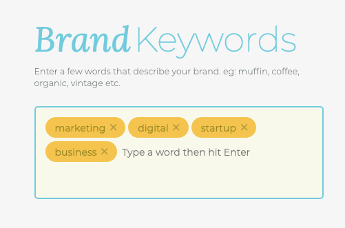
Step 2: Enter some keywords.
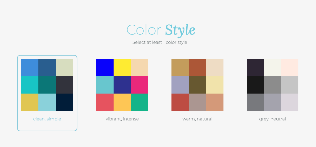
Step 3: Pick the color style you like.
Step 4: Logo options are generated for you.
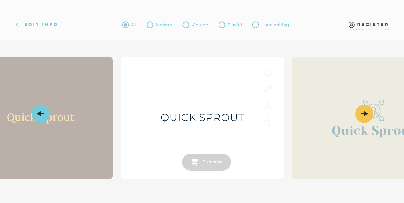
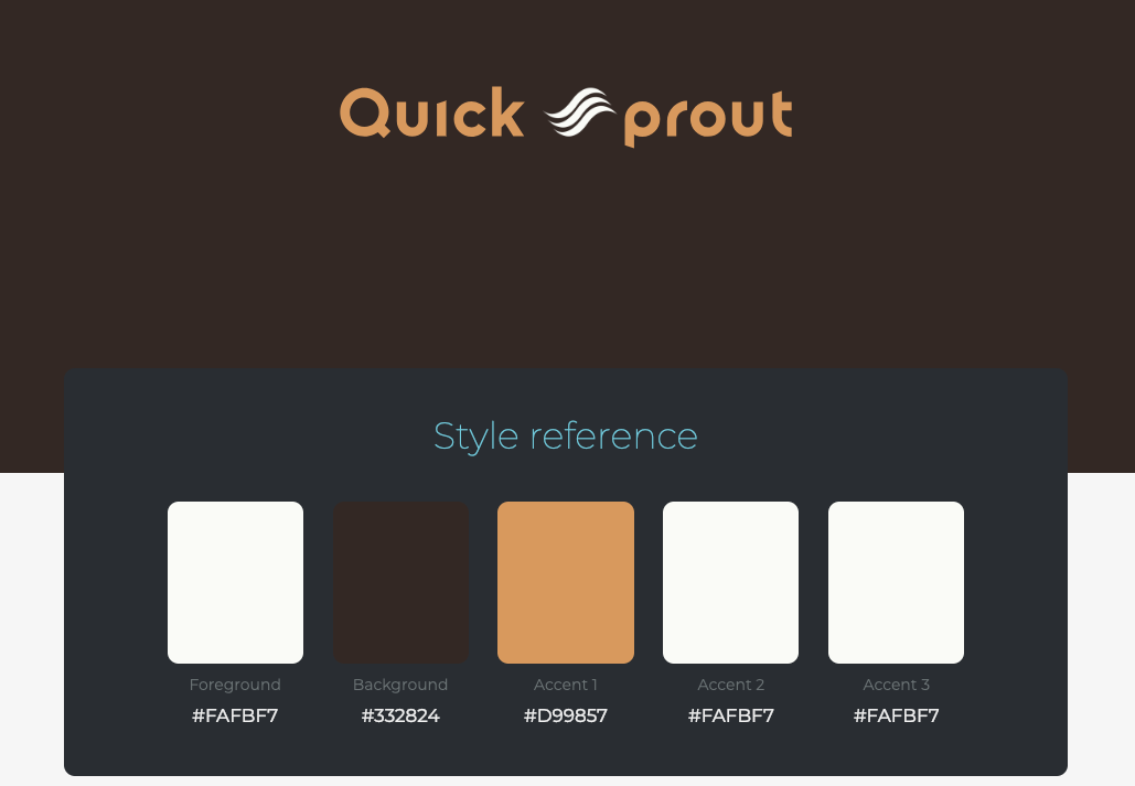
Step 5: Choose a logo and see style details.
Step 6: Purchase the logo. (There are 3 options.)
Give it a shot, and see how it feels. If it doesn't work, there's a second option.
If you don't like the outcome of Brandmark, your next option is to go full-on DIY. With this approach, you're simply going to use a standard lettermark logo. It's essentially just picking a font. (Unless, of course, you have design skills, in which case, this entire guide is probably irrelevant to you anyway.)
First, decide on your fonts.
I strongly recommend sticking with Google Fonts. Here is a great article on different options for Google Font combinations. Pick one of the combinations that you like.
There is a great free tool to test different Google Fonts and color combinations called Typecast.
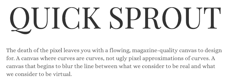
Here's an example. Number 5 on that list is Playfair Display, Alice. I'm going to take that and use those for my brand's fonts. I'll use Playfair Display for my logo. Then on my website, I'll use Playfair Display for headings, and I'll use Alice for my body font.
It will end up looking something like this…
While you're testing different fonts, you can also test and select colors.
Here is a good article on the best logo color combinations. Pick one you like and try it out.
This one is pretty cool, so I'll use it as an example:
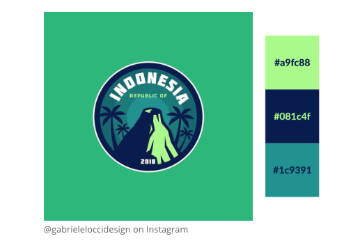
In this case, I would probably use the dark blue (#081c4f) as the primary font color for the body of my website, and potentially for my logomark. Then, I'd use the secondary greenish colors (#19fc88) and (#1c9391) throughout the website.
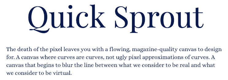
Now I have an example of two fonts, one of which I am using for my logomark (as seen above), and I have three colors.
That's all I really need for my brand identity. Now, I can use these elements everywhere on my website, business cards, emails, social media accounts, etc. and my brand is clear and consistent. It's certainly not going to win any awards, but it's functional and it'll work for now.


