Norwegian government report outlines how Facebook and others trick users into giving up their privacy

The combination of privacy intrusive defaults and the use of dark patterns, nudge users of Facebook and Google, and to a lesser degree Windows 10, toward the least privacy friendly options to a degree that we consider unethical.
We question whether this is in accordance with the principles of data protection by default and data protection by design, and if consent given under these circumstances can be said to be explicit, informed and freely given.
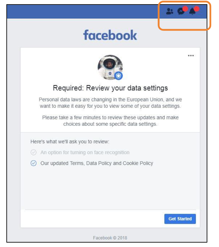
A trivial but perfectly illustrative example: Facebook uses fake "notification" dots to encourage users into quickly agreeing to new terms to get access to their account.
Red dots signifying message notifications were the only part of the regular Facebook interface that was visible during the process, leading the user to think that there were messages waiting. These dots were displayed even if the user did not have any unread messages. This placed further pressure on the user to go through the process quickly, and not delete the account, so that these apparent messages could be read. If this was in fact a deliberate design from Facebook, this is a very clear example of use of dark patterns to manipulate users.


